

In descriptive, correlational, and experimental research, statistics are tools that help us see and interpret what the unaided eye might miss. Sometimes the unaided eye misses badly. Researchers invited 5522 Americans to estimate the percentage of wealth possessed by the richest 20 percent in their country (Norton & Ariely, 2011). Their average person’s guess – 58 percent – “dramatically underestimated” the actual wealth inequality. (The wealthiest 20 percent possess 84 percent of the wealth.)
Accurate statistical understanding benefits everyone. To be an educated person today is to be able to apply simple statistical principles to everyday reasoning. One needn’t memorize complicated formulas to think more clearly and critically about data.
Off-the-top-of-the-head estimates often misread reality and then mislead the public. Someone throws out a big, round number. Others echo it, and before long the big, round number becomes public misinformation. A few examples:
Statistical illiteracy also feeds needless health scares (Gigerenzer et al., 2008, 2009, 2010) . In the 1990s, the British press reported a study showing that women taking a particular contraceptive pill had a 100 percent increased risk of blood clots that could produce strokes. This caused thousands of women to stop taking the pill, leading to a wave of unwanted pregnancies and an estimated 13,000 additional abortions (which also are associated with increased blood clot risk). And what did the study find? A 100 percent increased risk, indeed-but only from 1 in 7000 women to 2 in 7000 women. Such false alarms underscore the need to teach statistical reasoning and to present statistical information more transparently.
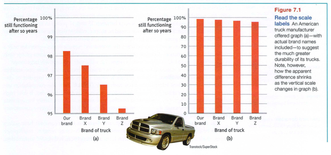
Once researchers have gathered their data, they may use descriptive statistics to organize that data meaningfully. One way to do this is to convert the data into a simple bar graph, called a histogram, as in FIGURE 7.1, which displays a distribution of different brands of trucks still on the road after a decade. When reading statistical graphs such as this, take care. It’s easy to design a graph to make a difference look big (Figure 7.1a) or small (Figure 7.1b). The secret lies in how you label the vertical scale (the y-axis).
The next step is to summarize the data using some measure of central tendency, a single score that represents a whole set of scores. The simplest measure is the mode, the most frequently occurring score or scores. The most commonly reported is the mean, or arithmetic average-the total sum of all the scores divided by the number of scores. On a divided highway, the median is the middle. So, too, with data: The median is the midpoint-the 50th percentile. If you arrange all the scores in order from the highest to the lowest, half will be above the median and half will be below it. In a symmetrical, bell-shaped distribution of scores, the mode, mean, and median scores may be the same or very similar.
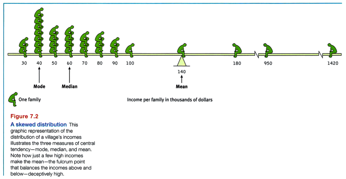
Measures of central tendency neatly summarize data. But consider what happens to the mean when a distribution is lopsided, or skewed, by a few way-out scores. With income data, for example, the mode, median, and mean often tell very different stories (FIGURE 7.2). This happens because the mean is biased by a few extreme scores. When Microsoft co-founder Bill Gates sits down in an intimate cafe, its average (mean) customer instantly becomes a billionaire. But the customers’ median wealth remains unchanged. Understanding this, you can see how a British newspaper could accurately run the headline “Income for 62% Is Below Average” (Waterhouse, 1993). Because the bottom half of British income earners receive only a quarter of the national income cake, most British people, like most people everywhere, make less than the mean. Mean and median tell different true stories.
Knowing the value of an appropriate measure of central tendency can tell us a great deal. But the single number omits other information. It helps to know something about the amount of variation in the data-how similar or diverse the scores are. Averages derived from scores with low variability are more reliable than averages based on scores with high variability. Consider a basketball player who scored between 13 and 17 points in each of her first 10 games in a season. Knowing this, we would be more confident that she would score near 15 points in her next game than if her scores had varied from 5 to 25 points.
The range of scores-the gap between the lowest and highest scores-provides only a crude estimate of variation. A couple of extreme scores in an otherwise uniform group, such as the $950,000 and $1,420,000 incomes in Figure 7.2, will create a deceptively large range.
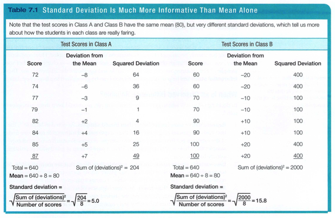
The more useful standard for measuring how much scores deviate from one another is the standard deviation. It better gauges whether scores are packed together or dispersed, because it uses information from each score (TABLE 7.1). The computation assembles information about how much individual scores differ from the mean. If your high school serves a community where most families have similar incomes, family income data will have a relatively small standard deviation compared with the more diverse community population outside your school.
You can grasp the meaning of the standard deviation if you consider how scores tend to be distributed in nature. Large numbers of data-heights, weights, intelligence scores, grades (though not incomes)-often form a symmetrical, bell-shaped distribution.
Most cases fall near the mean, and fewer cases fall near either extreme. This bell-shaped distribution is so typical that we call the curve it forms the normal curve.
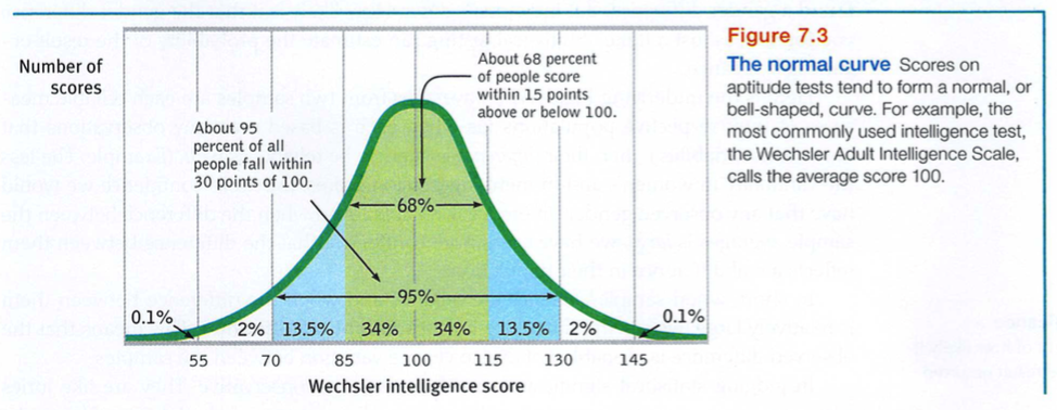
As FIGURE 7.3 shows, a useful property of the normal curve is that roughly 68 percent of the cases fall within one standard deviation on either side of the mean. About 95 percent of cases fall within two standard deviations. Thus, as Module 61 notes, about 68 percent of people taking an intelligence test will score within ±15 points of 100. About 95 percent will score within ±30 points.
Data are “noisy.” The average score in one group (breast-fed babies) could conceivably differ from the average score in another group (bottle-fed babies) not because of any real difference but merely because of chance fluctuations in the people sampled. How confidently, then, can we infer that an observed difference is not just a fluke-a chance result of your sampling? For guidance, we can ask how reliable and significant the differences are. These inferential statistics help us determine if results can be generalized to a larger population.
In deciding when it is safe to generalize from a sample, we should keep three principles in mind.
Perhaps you’ve compared men’s and women’s scores on a laboratory test of aggression, and found a gender difference. But individuals differ. How likely is it that the gender difference you found was just a fluke? Statistical testing can estimate the probability of the result occurring by chance.
Here is the underlying logic: When averages from two samples are each reliable measures of their respective populations (as when each is based on many observations that have small variability), then their difference is likely to be reliable as well. (Example: The less the variability in women’s and in men’s aggression scores, the more confidence we would have that any observed gender difference is reliable.) And when the difference between the sample averages is large, we have even more confidence that the difference between them reflects a real difference in their populations.
In short, when sample averages are reliable, and when the difference between them is relatively large, we say the difference has statistical significance. This means that the observed difference is probably not due to chance variation between the samples.
In judging statistical significance, psychologists are conservative. They are like juries who must presume innocence until guilt is proven. For most psychologists, proof beyond a reasonable doubt means not making much of a finding unless the odds of its occurring by chance, if no real effect exists, are less than 5 percent.
When reading about research, you should remember that, given large enough samples, a difference between them may be “statistically significant” yet have little practical significance. For example, comparisons of intelligence test scores among hundreds of thousands of first-born and later-born individuals indicate a highly significant tendency for first-born individuals to have higher average scores than their later-born siblings (Kristensen & Bjerkedal, 2007; Zajonc & Markus, 1975). But because the scores differ by only one to three points, the difference has little practical importance.